Thursday, 22 March 2018

Envelopes


Exploring envelopes to hold the CV and work folder in.

The CV and work folder will be posted to companies and be competing against other applicants therefore its important for the client to stand out amongst the other many white envelopes. 

It's important for the client to stand out and make a good first impression and that might be down to having a unique envelope. 

Examples of creative envelopes :
Idea No 1 


As the clients work is often printed onto materials and fabric, considering using these materials to construct the envelope as shown above would give a unique quality. 

Drawback - The material would have to be fairly rigid to prevent it breaking in the post and would also need to support the content inside and prevent it creasing. This is unlikely with a fabric and also the seal would be tricker to develop. 

Another issue would be writing the name on address onto the fabric.  

Idea No 2


Placing one of the clients design on the inside of the envelope makes the envelope special but in a subtle way. This might be more suited to busier designs on the inside. 

Idea No 2


Having the envelope fold out into one of the clients prints would work well in further promoting the clients work and would allow the company to keep a slightly bigger example.

Again this might not be the safest option if this were to be posted however would work well if the client were to be personally handing it to a company.

Idea No 3 


This has a more natural presentation but more importantly allows more depth and therefore thicker paper to be used for the booklet and card. This might mean that the print booklet is less necessary however a the cards could be held together by this envelope only. 


Using Drawings on the Envelope

Placing some of the clients drawings used to develop her prints was an initial idea. It gives the company a sneak peak of the potential of the client while also presenting the client to be unique amongst other applicants using white envelopes. It aims to make the company want to pick it up and look inside over other competing letters.

Important consideration when designing the envelope.

-Leave space for the stamp
-Leave space for the name and address
- This envelope may be used in the future alongside new projects - so the envelope does not have to be specific to the current prints presented inside. 
- Think about the design on the inside of the envelope, should it match or contrast the outer design? Should it complement the booklet or not as it may be used for other means?
- It must be sized correctly to fit the work folder
- What paper should be used so that it can fold properly whilst not being too flimsy?
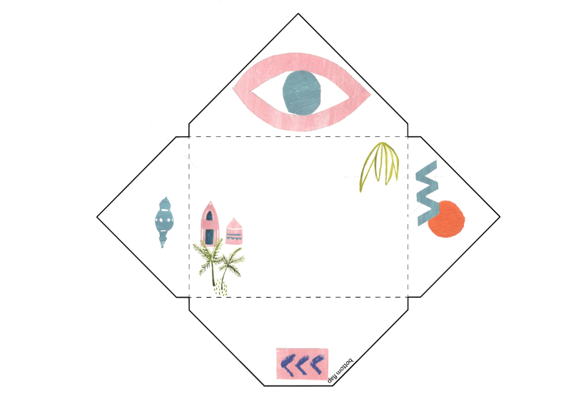
Idea No.1
The orange circle creates a spot for the stamp and the rest of the design on the front is minimal to prevent confusion with the name and address, while the back is busier and more more playful.  I like the idea of the eye on the opening compartment as it subtlety is asking you to take a look inside!


Idea No.2
Again simple on the front, more drawings on the back
This was just to experiment with different drawings and see what would look best in the mock ups. 


Idea No. 3 
This is a more busy design however it still leaves space for the important information. This design shows off more drawings. 

MockUps

No.1 Back


No. 1 Front


No. 2 Back 


No.2 Front


Inside of the envelope & the fitting the correct size 


Tuesday, 20 March 2018

Evaluation


End of Module Evaluation

I found the G . F Smith brief most engaging, the outcome was one of my strongest as in all areas more effort was put in. This is largely down to the growing interest I have in colour and exploring new possible paper-stocks with the G.F Smith sample booklet. I intend to continue to experiment with new paper stocks in future projects. My final outcome for this project changed to what has been planned due to this issue with the paper delivery. It was noted that in industry these issues do arise so it was important for me to be able to adapt to an alternative solution.

Within my role working as a collaborative I was able to critique design decisions of my own despite my partner thinking otherwise.  I felt comfortable with taking responsibility for the design however felt my creative partner could have put more input into other areas of the project.

Throughout each Research was done across a range of different areas within briefs which lead to much more fulfilled outcomes, more research could have been done in the Missile and Mark My Words brief.

The sustainability and mark my words brief were treated as smaller briefs. Working on smaller briefs was good practice and coming up with initial ideas, however the outcomes were not as strong as the bigger briefs in which had time to develop in more depth. For the G.F Smith Brief and my collaborative brief, they were treated as the main brief and therefore were planned to have enough time to initially think much broader in ways to approach the brief and also develop in more depth. Making sure there was enough time to test my ideas was crucial in these two projects and it resulted in the final outcome functioning correctly without production errors, therefore working on multiple briefs did require careful time management. Overall these briefs have built up my confidence in applying to future live briefs and have encouraged working more as collaborative with other creatives.

Monday, 19 March 2018

1 Day Brief - Mark My Words


Word chosen to research - Ketchup 


Ketchup is identified as belonging to British and American culture, however from research it was found that ketchup originates from China in the 17th century as a sauce of picked fish and spices. It was first known in Chinese as kôe-chiap or kê-chiap. Its popularity then spread to Singapore and Malaysia, where it became called “kay-chap”. It was then encountered by British explorers and was interpreted from Kay-Chap to Ketchup. It wasn’t until the 19th century that tomato ketchup was invented and now today More than 650 million bottles of ketchup are sold every year throughout the world.

Initial Typography Experiments - 

An experiment involved using actual ketchup to created type and also other red liquids. This was done in order to grasp the texture and character the word suggested. 


2) Using Serif typefaces for the origin 
‘Koechiap’ was the original and initial spelling and pronunciation of ‘ketchup’. Using a strong, serif, classic typeface was a decision made based on reflecting the archaic qualities the word portrayed. Georgia was used as it appears traditional but not old fashioned. The importance of it not appearing old-fashioned was that this was not what I wished to be communicated, I wanted it to show a strong clear word that exists as the core to the word we use today


How language fades - Showing the transition.
 ‘Kay-Chap’ was the middle word between ‘Koechiap’ and ‘Ketchup’. Kay-Chap was presented with fading typography, attempting to show a transition. Experiments involving creating movement through adjusting the opaqueness occurred at this stage. 


How common the modern word is used today
Different words were repeated different amounts on the paper in order to reflect how common these words are used. Ketchup having the most and ‘Koechiap’ the least, this illustrates how when the word was westernised it became more popular. 


Photographs of final outcome