Monday, 27 March 2017
Saturday, 11 March 2017
Colour Theory Book No.2
Colour Theory Book No.2
Different colours and combinations evoke particular moods, learning about how different choices of palettes in design can impact the work differently was something I have developed a better understanding of through this module.
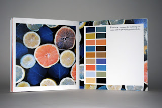
My initial design for the colour theory book was unsuccessful in displaying colour combinations that engaged me. Therefore, deciding to improve my design, I collected imagery that colour wise would be something I would use in my own designs. From learning how to directly copy the colour from the image and make a colour pallet out of it, I began noticing that colours existed within these images that I wouldn’t have otherwise noticed.
Compared to decisions made earlier on in the initial colour theory book, there is an evident improvement in the combinations and choices of colour used in my work, demonstrating a clearer understanding of the tone of voice certain colours have and what they can say about work. Through this practice of arranging colours alongside one another, relationships between different colours came about, leading to later on in the module using colour more effectively in my designs.
Friday, 3 March 2017
Design Development
From my first design came about multiple changes influenced by crit feedback. One of the first decisions was to remove the title at the top as it wasn’t necessary as the title is already included in the design. In my first design I had made the spine black to fill the design up more however I was informed this wasn’t necessary and by removing this too it didn’t make the design bare but made it look a lot cleaner and noted from my research into the winning designs last year- a simpler design was in better favour. Along with removing the black spine I removed the black fill running through the barcode for the same reason.
In the development of this design I tried to see what effect removing all the black lines had. Although I found the visuals of this intriguing however it took away the concept of confidential information being withheld from the reader. Although it clearly shows a disjointed and fractured characteristic, it wasn’t a strong enough representative of the novel.
Throughout the development of this idea I started thinking about refining the layout. By moving the barcode up and shifting the authors name and title to sits at the top of the two paragraphs it made it look a lot cleaner.
In one of the original book cover designs for cold blood, Truman was dissatisfied with the tone of blood being not dark enough. With this is mind I adjusted the colour of the blood splat I was using in my designs to be a much deeper red. By adjusting the tone of red to so dark it almost looked like ink, it worked much better with the design and brought it together more. Although this design decision improved the aesthetic, from feedback I was critiqued that the visual would be much stronger without the blood and makes a cleaner finish.
Wednesday, 1 March 2017
Subscribe to:
Comments (Atom)


