Monday 31 October 2016

'Conversible' Logotype - Final Ideas


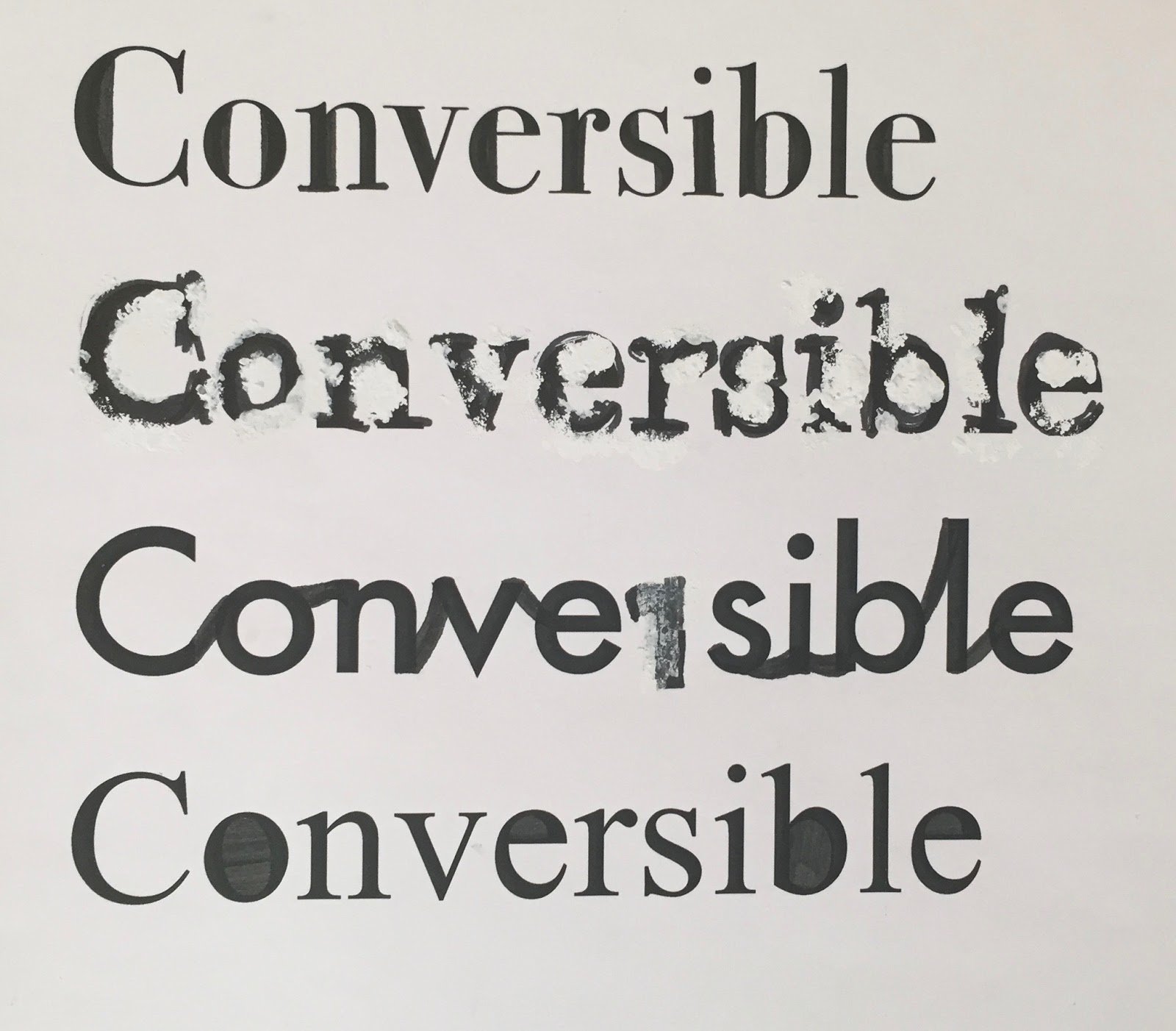
Adding lines gives the logotype a sturdy visual. Depending on the  composition and shape it has different effects.

Either side of the word could act as handles suggesting a strong company however put on one side below and the other side on top could reflect a speedy service. Building on this idea I altered the shape of the line to have a point and faded it out from each point in order to emphasise and more accurately communicate this. 
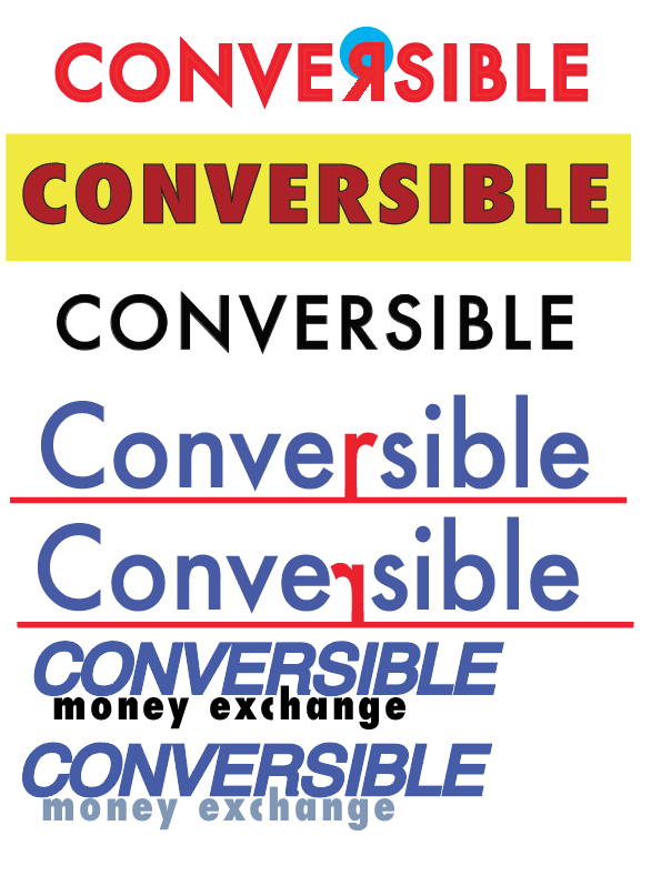
It’s important the colour of my logotype mirror the qualities of the company. Dealing with customers’ money its vital to comes across trustworthy and simple. From research I found that blue suggests trustworthy and honest principles, it also exists as a calming colour and therefore was suited to my designs. The colour’s also contrast one another allowing the letters to standout.

In my development process one  idea was to create a recognisable feature within the word itself. By placing the ‘o’ inside the ‘c’, not only did it even out the length either side of the ‘r’ (to suggest a equal and fair exchange rate it also created a symbol that might help an audience quickly recognise the company.

Another feature I found successful was changing the ‘e’ to ‘€’ as it provides a clear visual that instantly can be recognised in regards to money and exchange. I really like how the € is interpreted in the futura font as well.


Saturday 29 October 2016

'Conversible' Logotype Development


With more effort put into making my logotype appear contemporary and smart while still recognizable as a money exchange company, I believed it would be more successful. As a smarter logo with more thought and care put in will suggest a better, more trustworthy service appealing to more customers - And dealing with customers money it’s very important to come across trustworthy.

The word ‘converse’ alone gives off a friendly tone and the remainder of the word ‘ible’ could exist as a memorable abbreviation for the company. As noted from my first sketches, I thought of different ways to separate the word, such as changing the font and adjusting the lines underneath.  However from feedback I found keeping the words as one was more popular.


'Conversible' Logotype Development


Thursday 27 October 2016

'Conversible' Starting Sketches


With one of my aims being to grab attention I started experimenting with weight. By making the stokes thicker I found it made the letters harder to read.
I also compared the effect of having letters filled with colour with letters just outlined. By combining the two I was able to separate different parts of the word, which could be something I developed further in my project, as it could exist as a recognisable feature for my company.


Wednesday 26 October 2016

Conversible - What my brand is

Conversible - capable of bpoeing converted or transposed.

Who is the company?
A trustworthy money exchange company


What do they do?
Convert money into different currencies at the best rates. 

Who is the target audience? Everyone, mainly adults and travellers

Where will the logo appear? Airports, websites, street shop signs

What’s the personality?
·      Trustworthy -  as it deals with people’s money
·      Bold - so its noticed in a busy area like an airport  

·      A simple, easy and stress free service


     For this brief I decided to develop a logotype for a money exchange company. From my research I found that existing logos for money exchange company's were very simple and often slightly tacky. Therefore my aim of the project was to create a logotype that appeared trustworthy, bold and smart. It's  important for my logotype to be adaptable for both large and small scale displays e.g. shop signs and websites.
    
     From my knowledge there isn't a go-to money exchange company and its difficult recognize the differences between them in regards to which provides better service than the other. Therefore I feel my rebrand will offer a solution to this problem, creating a recognizable logo that communicates a reliable and professional company.