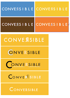
With more effort put into making my
logotype appear contemporary and smart while still recognizable as a money
exchange company, I believed it would be more successful. As a smarter logo
with more thought and care put in will suggest a better, more trustworthy
service appealing to more customers - And dealing with customers money it’s
very important to come across trustworthy.
The word ‘converse’ alone gives off a
friendly tone and the remainder of the word ‘ible’
could exist as a memorable abbreviation for the company. As noted from my first
sketches, I thought of different ways to separate the word, such as changing
the font and adjusting the lines underneath.
However from feedback I found keeping the words as one was more popular.


No comments:
Post a Comment