
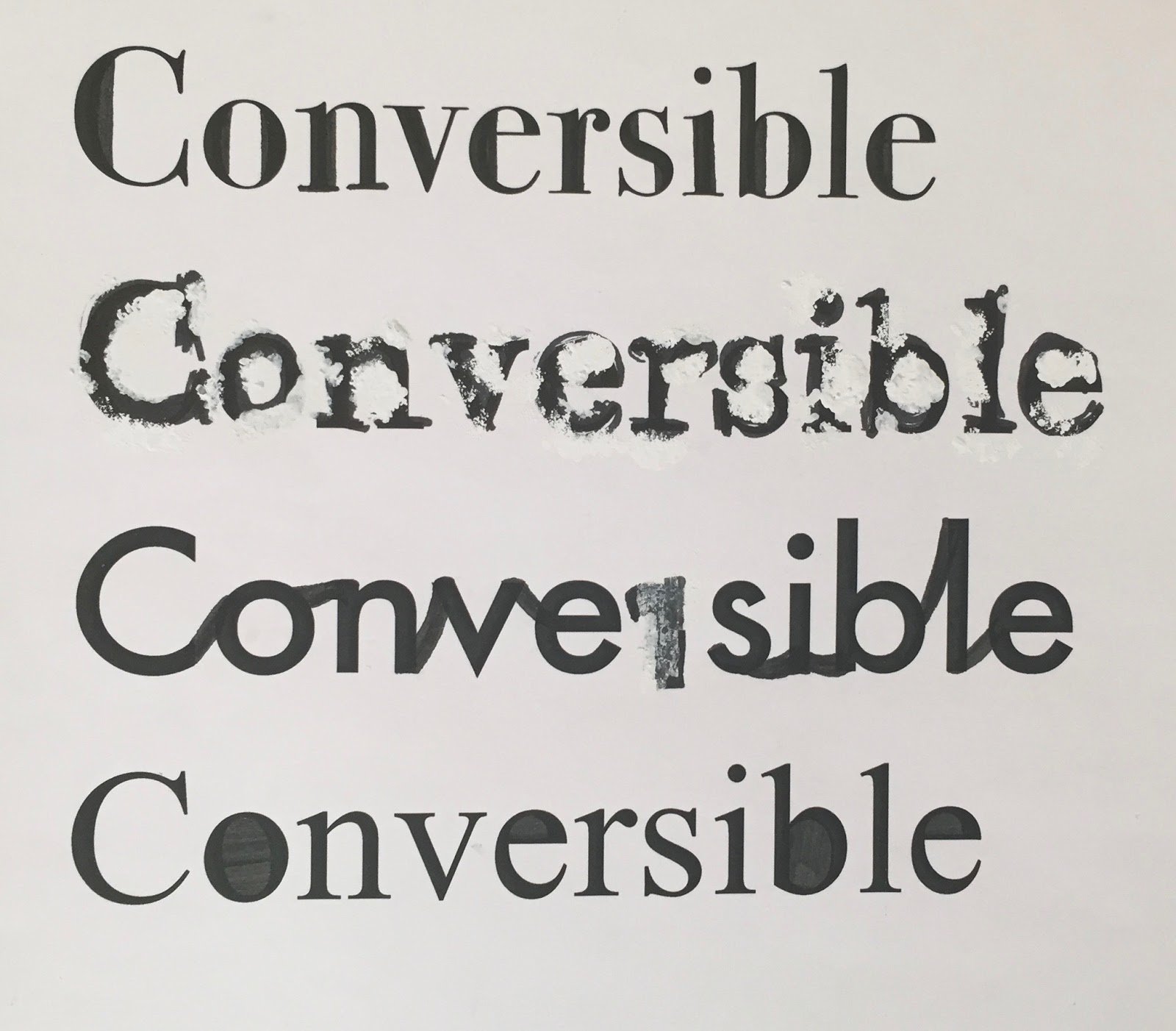


With one of my aims being to grab
attention I started experimenting with weight. By making the stokes thicker I
found it made the letters harder to read.
I also compared the effect of having
letters filled with colour with letters just outlined. By combining the two I
was able to separate different parts of the word, which could be something I
developed further in my project, as it could exist as a recognisable feature
for my company.
No comments:
Post a Comment