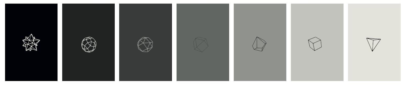
Scratching away instead of ripping pages

I would have liked to refine the final outcome further however spent too much time on other areas of the project. I would have like to tested another way of presenting this concept. Instead of tearing away pages, the poster could have worked by the audience could scratching away different sections of a design to reveal the shapes underneath. This idea had the potential to improve the design as it would use less paper and through placing the shapes all on one page beside one another, it would allow the audience to observe the whole series rather than individuals only reveal one stage each. It would also mean that people who don’t take part can observe the changing structure of shapes.