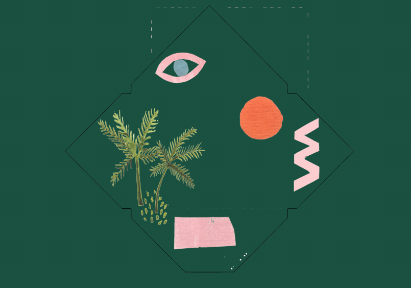
Tuesday 20 February 2018

CV Type


Type & Colour 

From the interview questions and observing the clients design style, it was noted that herself and her work tend to be delicate, feminine, contemporary and young. It was highlighted how she finds enjoyment in her work especially drawing and doing this by hand. It was important to be able to capture this personality as well as present a bold and strong type to allow her name to be in the spotlight. 

Initial Type Ideas :


Final Type 


Paduka Script font is used for the client’s name which appears on the front of the folder and on the print cards. It is always a larger size to the other text as it is important the clients name is in the spotlight. This font captures the personality of the client with its handwritten and playful style.


Cutive Mono was used alongside the Paduka Script font. To complement and add character to the headers and displays of the client’s name.  This font has better legibility and is suitable for body texts.


Type Colour :

Each card inside the booklet has a different colour, this was chosen based on the dominating colour presented in each individual print. This highlighted the colour tones the client uses, which in this case are very muted and organic colours. 


Using this colour swatch could then be converted to the  design of the envelopes...


Monday 19 February 2018

Collaborative Interview


I also asked Holly to collect a colour swatch based on her prints for her series abstract coral. These colours could then be easily applied to the design of the pack . 


Saturday 17 February 2018

G.F Smith Brief - Constructing Designs

Constructing Designs 


I decided to adopt the technique of Atelier Bingo's work through adding abstract line drawing of my own. Each drawing was designed to also visualise the mood of a particular month. For example hotter months included more wavey lines to suggest the heat where as winter might include more circles and dots to suggest snow or rain. 


Using the G.F Smith colourplan series of paper, I arranged the colours into the separate tones and temperatures of spring, summer, autumn and winter. I often reflected back to the mood boards I created in my research to copy contrasts and combinations. 

The composition of each collage was done through trying out different arrangements until it reflected the personality of a particular month I was aiming for. Throughout this process numerous of different combinations were made for each month before achieving the final design. 

The use of circles would often be identified as the sun, 
movement was created through using a spectrum of tones from light to dark 

not gluing down the paper abled the designer to be adjusted but also allowed them to sit slightly raised from the paper beneath, giving in depth which made the paper seem more real and tactile which was one of the aims of the calendar - "to highlight the tactile of paper'

My calendar wants to show off what you can do with paper. The calendar design uses entirely only the G.F smith paper. It acts as a series of small artworks that are fun, playful and also encouraging to any one to give . a go for themselves.   


Wednesday 14 February 2018

Atelier Bingo - Calendar Inspiration

Atelier Bingo


Atelier Bingo is an duo who experiment with screen printing and other graphic techniques to create colourful and abstract works.  Maxime Prou and Adèle Favreau, are the two members, who have a common passion for illustration, graphic arts and pattern design. I looked at there work for inspiration when designing my calendar. They specialize in making screen-printed posters, using not only different artistic techniques, collage, gouache, pens, inks, etc, but also various shades of colour combinations to create electrifying artwork.

Interview questions:
You work with different media -are you more connected to any of them in particular?
Adèle: Paper is our favourite medium and will always be. We like to play with it, to touch it. There are so many different types of paper out there, we want to experiment as many as possible – we don’t think we could ever get tired of it. Throughout our time at uni, we were really interested in publishing and in the book industry in general. This common passion quickly fed into our projects.
Why is colour so important in your work? How do you decide on your motifs and themes in your work?Maxime: Colour is something very important to us. It’s a risk, a constant challenge. It brings a part of surprise to our work.
Adèle: As for fabric/material, we like them raw, whether as a picture or as a cut-out. We like to experiment with these, crop, re-arrange but always without any computer software!


“We build the image up, color by color, and we never know what it will look like before the last color is added. That’s our bingo style!

Response: 

The G.F smith brief stated the importance of the calendar celebrating the tactility and power of colour. Atelier Bingo’s work uses colour in a celebratory way and each piece has its own mood. An initial idea was to use the coloured card of G.F smith to create my own moods and collages to represent the mood of different months.