Friday 19 May 2017

Map Idea


Another idea was to include a map of the lantern trail within the design. The red space within the lantern was a good space in which to show this. This design displays this idea, however as you can see the map is a very simple representation of the trail shown below and would fail to actually act as a map of any sort due to it not being placed in context. It is also very small and therefore would not be functional. 

Made In Leeds - Final Outcome


In response to this, the design developed to including ‘Made in Leeds’. This idea came about from ‘Made in China’ being commonly seen on products. Therefore, taking this and changing it to ‘Made in Leeds’ clearly informs people that this is a Chinese event taking place in Leeds. The tassels have been removed and replaced with a barcode to bring together the ‘Made in Leeds’ part of the design and the Chinese lantern. By having the barcode in red rather than black it does so in a subtle way and keeps the design as one piece rather than breaking it up. 


Evaluation - OUGD406

Evaluation

Through on going practice I’ve become better at responding to design problems through gaining a better understanding and ability to construct and interpret visual language.
                        
Working both independently and in group discussions amongst peers, it caused my work to be continuously critiqued which has helped achieve much more refined 
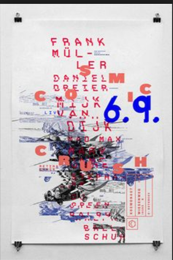
and successful outcomes. Working collaboratively worked much better in ‘speaking from experience’ than the ‘exhibition branding’ this could be because of the group. In choosing who to work with I was more comfortable in discussing ideas and putting myself forward, making the project include more of my own input.  

Each brief requires a self-evaluation in relation to initial ideas, development and production. By repeating the same requirements, it has become much easier and clearer to me as to why I have made certain decisions and the impact they have. Time-management has also become less of an issue because of practice.  

New graphic design mediums have been introduced to me such as screen-printing and book binding as well as tools used in digital design software. Workshops at the start were really helpful and I look to try more workshops out next year if possible, in order to extend my design into new mediums.

The briefs all speak to different audiences, being able to adapt my creative decisions to target these different audiences is something I believe to have done well in this module.
Professional practice was a brief that required this skill.  engaged me in that it took me out of the classroom and shed some light on how throughout course I should be entering competitions and putting my work out there. This brief gave me the opportunity to design for a specific target audience which will be useful in future projects.

I found ‘Leeds public spaces’ the most enjoyable brief as it had a lot of freedom allowing creative decisions to be very personally directed and most strongly encouraged individual interests to come forward. This brief also introduced screen-printing and is a practice I look forward to using again.

The collaborative practice challenged communication still both design based and within working with members of my group. As a brief I thought it worked well however within the group I felt I should have pushed to have more input in design decisions.

I would have liked to have more time spent on the reflective practice brief as our final outcome was rushed to some extent. However, working with a group of my choice, I believe communication was much easier and it also made suggesting ideas between us more relaxed and therefore lead to a very honest content.


To conclude, this module has introduced me to a variety of different principles such as typography, layout and colour as well as introducing me to different types of design such as information graphics and editorial. It has challenged me and pushed me however as a result I feel much more confident.

Speaking from Experience


Meeting New People 


The book has been put together by three girls new to one another this year, putting this aspect into the work was something as a group we also felt important as a big part of first year is meeting new people. Therefore, mirroring the content page, is an illustration of ourselves to say hello first of all. 

Speaking from Experience


The book successfully demonstrates processes we have learnt such as book binding layout and format. With collage being included it also communicates that hand-made work is encouraged too and graphic design is not strictly digital based. 


The screen-printing process

The screen-printing process 

While designing the poster, remembering this would be a screen-printed outcome considerations had to be taken into how the design would be made using this process. Due to this design not having any overlaps and only using two colours, the design was not as complicated as other designs might have been.


 - The process involved first pulling apart the design into the two colours and converting them into a stencil. 

- A mesh screen is used to transfer the ink onto a substrate, except in areas made impermeable to the ink by a blocking stencil.

 - A screen is made of a piece of mesh stretched  over a frame.

 - A stencil is formed by blocking off parts of the screen in the negative image of the design to be printed; that is, the open spaces are where the ink will appear on the substrate.

 - Before printing occurs, the frame and screen must undergo the pre-press process, in which an emulsion is ‘scooped’ across the mesh 

- the ‘exposure unit’ burns away the unnecessary emulsion leaving behind a clean area in the mesh with the identical shape as the desired image. 

 - A stencil is formed by blocking off parts of the screen in the negative image of the design to be printed; that is, the open spaces are where the ink will appear on the substrate.
 the ‘exposure unit’ burns away the unnecessary emulsion leaving behind a clean area in the mesh with the identical shape as the desired image. 

 - A stencil is formed by blocking off parts of the screen in the negative image of the design to be printed; that is, the open spaces are where the ink will appear on the substrate.

During the process having to line up the first colour in line with the second colour was unsuccessful a few times. As well as this, the ink was not being converter to the paper from the screen fully and therefore gave the poster a more textured affect. This problem mainly occurred from there being too much emulsion coated on the screen, also it was not washed 


Initial Ideas - Leeds Public spaces


 is simple and aimed to use a font that illustrated the aesthetic of black brush strokes which I found from research being related to Chinese calligraphy. The Lantern was photographed in research too, however was edited in photoshop, by changing the threshold, brightness and contrast making appear more blocked out and illustrative.


again uses a font that has a brush stroke aesthetic, however this design uses a hand drawn illustration from a collage made before instead of a photograph. With this design having a very dark background layer it brings the white lantern into the spotlight and communicates the illuminative personality of the festival. With one lantern placed behind the other it also creates a sense of depth and atmosphere of the festival to the design.

Initial Ideas - Leeds Public spaces


The letters vary in font and colour as they try to represent the large variety of lanterns shown at the festival. This is emphasised with tassels being placed underneath the letters, illustrating them being hung up. This design is very bright and colourful giving it a strong celebratory feel. Some of the fonts used and colours however do not work that well together.

Collage Research and Experimentation - Individual Practice


Research - Individual Practice


Lantern Photography - Individual Practice


Research led to visiting a Chinese supermarket, where by using photography, documentation of traditional Chinese colours and lanterns were collected to then further refer to.

From these observations it was noticed that red was a very common colour, as well as gold. This lead me to looking further into colour in Chinese culture From that it was found that colour in Chinese culture refers to the certain values that Chinese culture attaches to colours. Black, red, white and yellow are viewed as standard colours. Red symbolized good luck and happiness and the other colours correspond to the elements of water, fire, wood, metal and earth.

Research also involved looking at other Chinese style art, in which often showed black brush stokes, which steamed from Chinese calligraphy, this style of back brush strokes was something I indented to use within my posters.

For research, a variety of colours and textures were collected from magazines that were representative and celebratory of the event. This then led on to creating a collage which was then scanned in and converted into a digital piece.


Research