Nostalgia - Initial Idea
- Initial ideas for the exhibition branding were based on celebration, historical references and events that shaped Leeds.
- the idea of old and new and how young people are looking at historical events that others may find nice to look back on.
- Reflecting traditional print methods that have been used to create the work, in comparison the the digital printing that is commonly used today.
- The word 'nostalgia' was decided upon as it is a sentimentality for the past, typically for a period or place with happy personal associations.
- suggested the idea of happy memories for the people of Leeds and that the exhibition could act as a reminder of the good events that have happened within the city.
However this idea was not taken forward due to the exhibition also displaying work that celebrates current events.
The Shape of Leeds - Initial Idea
- Thinking about how using a children's toy - the shape sorter could play a part in shaping the identity of the exhibition.


- The shapes and bright colours were something we took forward with us but toy itself came across too childish and not with enough substance.
- This lead to us developing our exhibition name - 'shaped'. As a group we agreed upon it was directly relatable to the exhibitions identity as its about the celebratory events within Leeds that have acted in a way that has shaped the city - and it was taken from the wording of the brief directly too.
- From developing the name shaped we began constructing a logo using triangles, circles and squares and experimented with arrangement, alongside different typefaces and colours. Initially we used primary colours for the shapes in replacement of the letter 'a', this worked well when it was a triangle
we decided that it wasn't suitable for an art exhibition as it was too plain, dull and did not reflect the traditional printing method that the posters are all made using.
Colour

- Initially we made a colour swatch from the Leeds College of Art website and applied these colours to the shapes. We found that using the bright purple in comparison to the lighter purple made the designs looked alot more cheesy and childish with the brighter purple. From a crit we were informed that our colour scheme was not strong enough to go forward with.
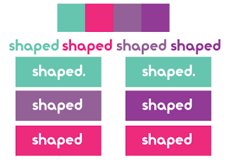

- We also took colours fro the mural and different elements that we found around the University building.
No comments:
Post a Comment