Tuesday, 31 January 2017

OUGD404 - Design Principles - New Geometric Paper Sculptures from Matthew Shlian


OUGD404 - Design Principles - New Geometric Paper Sculptures from Matthew Shlian

Paper Folding Exhibition


Paper artist Matthew Shilian, combines his talent for sculpture with a knack for engineering, producing geometric works that are composed of tight-knit tessellations. Shlian’s receptively folded works have lead to collaborations with scientists at the University of Michigan, together working to visualize research by translating paper structures to micro folds.
“Researchers see paper engineering as a metaphor for scientific principals; I see their inquiry as a basis for artistic inspiration,” said Shlian. “In my studio I am a collaborator, explorer and inventor. I begin with a system of folding and at a particular moment the material takes over.”

Friday, 27 January 2017

OUGD405


Arrows - OUGD405


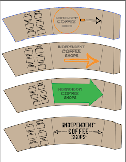
Coffee Sleeve - OUGD405


This signage system aims to divert coffee lovers away from chain coffee shops and direct them towards small hidden away independent coffee shops, found in the arcades and side streets of Leeds. 

Audience:
This signage system aims to attract and be understood by anyone in search of a coffee shop. It should appeal to people who are anti-globalization however, it also also aims to inform people who might not be aware of the issues of monopolizing a commodity such as coffee. Although this information is not displayed on the signage system itself, within the coffee shops depicted also exists a replica of the signage system being used as actual coffee sleeves with information on the back regarding the bigger scale importance of directing people away from chain coffee shops.  


Independent Coffee Shops - OUGD405 - Logo Fonts


Initially I was looking into the importance of considering how can I interact my sign with busy spaces to guide people away from chain coffee shops. One idea was to place diverting signage outside chain coffee shops to try make people avoid going in thinking about using text such as “avoid Starbucks like they avoid their taxes”. However learning more about signage I developed a better understanding into how this wasn’t effective and I needed to focus more on direction towards independent coffee shops in a more objective way.

The shape of my design is circular and placed around lampposts, this means it is easily adjusted to point in the intended direction. A problem with this would be it could it being tampered with and turned the wrong way, to resolve this issue it would have to be fixed with cable wire to prevent this. The material used to construct the sign was made of cardboard this also leads to issues regarding it being worn away by weathering or easily damaged. 

Initial designs used typefaces that aimed more on communicating the personality of an independent coffee shop over the important features type should have in a successful signage system. The developed designs did not include the text used in the previous designs, the final designs only displayed a number to show how long a walk it is in minutes to the closest shop. With a new aim to clearly display this number a heavy weighing sans-serif typeface was used in the design as it has good legibility with a large X-height and wide letter proportions with prominent ascenders/descenders to ensure a good legibility.

Thursday, 5 January 2017

Artist research - Karl Gerstner


MAP


This map shows the six coffee shops the signs direct to and the points of where the signs would go. There is no starting point, however are situated in busy areas and numerously placed. These points were chosen in regards to where direction would be most needed in places such as corners and crossover roads. The initial designs aimed to have information for more than one coffee shop and therefore this map illustrates the three closest coffee shops from each sign rather than the final design decision of the sign directing people only to the first nearest independent coffee shop.

Tuesday, 3 January 2017

Subjective Symbols


The visual language of this signage system is arguably a combination of both objective and subjective design. Independent coffee shops have a very personal feel and exist as individual particular places and with my system diverting people away from chain coffee shops it is arguably subjective. However, objectively, it directs people to the nearest coffee shop opposed to directing someone to a specified coffee shop, opinion on the quality of each coffee shop is removed therefore displaying no hierarchy.

The design itself only uses 3 flat colours brown, black and red. There is no text and features symbolism of coffee this causes it to be objectively understood by whoever. However other aesthetics, such as the materials used to build my sign (carboard) and the process being freehand without a grid, are uncommon in other objective sign systems and therefore the design becomes particular. 

With my design being used as actual coffee sleeves in the coffee shops as well as a signage system on the streets, it links up my system and helps it become better understood as well touching on being part of a community. It also allows people to keep the design if they like it and easily becomes distributed within Leeds.

Van Toorn however led the dissent against the ‘objective’ approach. Toorn agues passionately for the importance of designers retaining a sense of personality and romance in graphic design in his statement, “in fine art, experiments have been done for centuries, and perhaps we should pick up more from that tradition and use more form it”.  

Graphic designer Wim Crouwel, opposes Toorns argument, in his belief of graphic design being objectively built on clarity and simplicity with use of grids. Staying true to his original viewpoint of “I have always believed that graphic design is a discipline that should translate a message in an aesthetic and straight forward way, without personal interpretation that has no connection with that message.”