


Making a 'cheaper' layout
From printing the prototype it was highlighted that printing the whole book would be very expensive. Therefore concentrating the information by added more columns, decreasing the font size and also changing the typeface to regular rather than having everything in bold. This decreased the pages putting printing costs down. This layout overall gave the book a more refined and professional look.
Text and image were kept separate in order prevent pages from looking too busy. From feedback it was noted that this layout failed to keep readers engaged. In reaction to this feedback different composition were tried.
the DJ's words in the spotlight
The quotes that were not enlarged and put on one side of the red pages were then enlarged but not as big and kept in the position of where it was spoken. Having the columns almost framing the quotations. This is shown above.
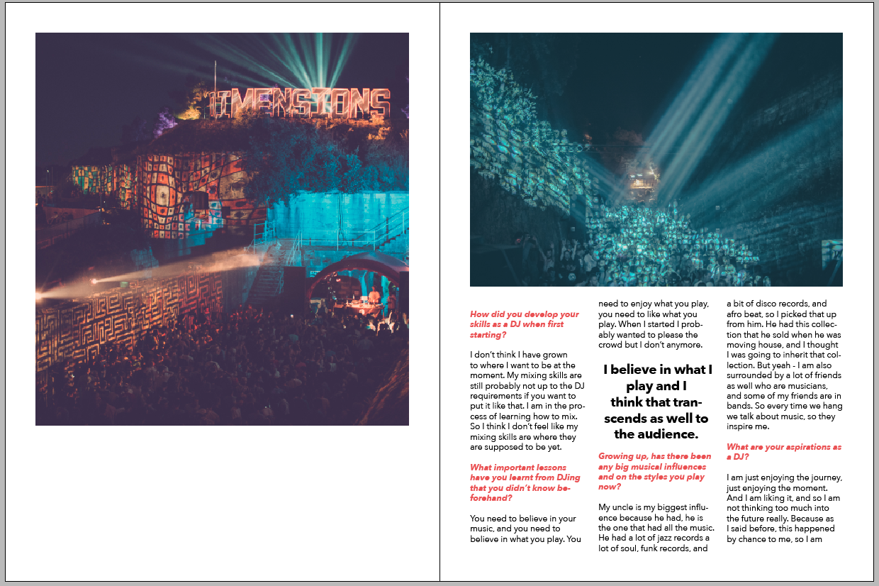
The aim of the DJ directory is to put a spotlight on the DJ's. With this is mind the quotations that stand out was also done in order to create this idea of them being in the spotlight. Having the quotes displayed like this also allows each quote to be positioned slightly differently to the other DJ's as they appear in different sections of the interviews. This allows each DJ to have its own spotlight.
No comments:
Post a Comment