Fifty-five
graphic experiments.
1. Identify and list the
properties/conventions of your books.
Format
The format of the
book matches the golden ratio
Layout
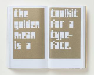
The consistent
composition of text gives the book a rigid feel.
With a lot of
blank space, shapes and different ratios emerge within the layout.
Imagery covers a
double page spread to keep consistency within the layout
Some pages are
block gold which puts emphasis on the golden ratio format the book has been
designed in.
The layout is
very minimal, keeping text to the left side which creates text to form
rectangles also suggestive of the golden ratio.
Type
The type is fairly small and in a san-serif, making it easy to read and interpret. This is important due to the large content.
Colour
The content of the book is entirely printed in only gold on white paper, making the book simple and keeping attention on
the content, whist also reflecting it.
Imagery
The style of imagery
is minimal and almost symbolic, which fits into the mathematical content of the
book.
Binding
2. Ways you could
tailor/add/manipulate these conventions to communicate the subjects more
effectively.
Layout
Emphasize the golden
ratio by having each page’s layout referencing the golden ratio.
Using the golden ratio as
a grid throughout the book.
Colour
The cover design includes
colour other than gold however does not include these colours elsewhere in the
book – this makes the design look messy – I would only stick to gold and one
other colour.
3. How your 'clients' subject matter
could be communicated through at least one of the conventions you have
identified.
As the book is based on a festival and the content is a platform for up
and coming DJ’s….
The format could
reflect the same shape and size of the DJ’s medium used to produce the music,
for example if the DJ’s are using vinyl’s or are more digital.
With the music
involving a lot of mixing and sampling, the paper could be a mixture of
different ‘materials’ or samples of different paper.


No comments:
Post a Comment