Examples of Packaging I like :
Studio Practice
Tuesday, 7 May 2019
MONOTYPE EVALUATION -The Beauty of a Minority Project Evaluation
This project has developed and
translated an understand of a community. This understanding comes from both
within and outside of it. This understanding has come from a range innovative
sources, both primary and secondary and has led to having a rounded comment on
this community.
The outcomes of this project
include a publication, poster series and jewellery collection. All of these
outcomes reflect the beauty of this minority. Although the publication and
poster series use a shape arrangement approach new to my practice, transferring
these designs onto jewellery was whole new process. Although this part of the
project was done in a collaboration, the process was still tested and learnt by
myself.
The publication is a successful
outcome in articulating the project and making sure the purpose of the designs is
understood, whereas the posters and jewellery are outcomes that leave more room
for the audience to make sense of what they see.
Although the initial design
ideas were used within the final publication, all designs were revisited and
refined to give a consistent finish to the project as a whole.
Although the final publication
was not as clean as I had hoped, it was understood through discussions that if this book were to be made in a professional
printers and book binding studio, these design problems would not occur. Despite
this, it was still taken on board to find a design solution as discussed on the
production design board.
The designs were all
shown to the Tamil speaker to gain a judgement on whether the designs were successful
and pleasing to a member of this chosen community. Feedback from Tamil speaker
was positive and although the designs were not intended to be legible to a Tamil
speaker, many were, while others simply looked interesting. It was commented
from the Tamil speaker that these designs were engaging and interesting to
understand how they developed from using the shapes of the Tamil alphabet.
Moving forward, working with shapes in this way is an approach I look to use again as the aesthetic is one, from feedback that has been popular and successful in catching attention from an audience.
Monday, 6 May 2019
V&A VIDEO GAME EXHIBITION
Design,
Play,
Disrupt.
Play,
Disrupt.
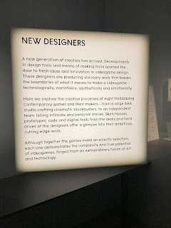
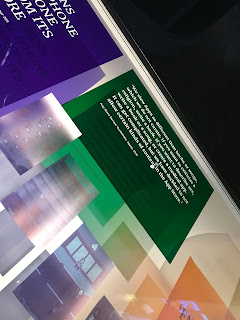
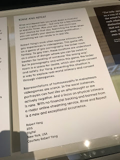
Research also involved visiting the exhibition ‘Design/Play/Disrupt’ at the V&A. This exhibition provided a unique insight into the design process behind a selection of groundbreaking contemporary videogames. The exhibition included design work showing concept art and prototypes featured alongside large-scale immersive installations and interactives. Rather than trying to tackle the rather trite argument of whether video games are art, it states that they are and goes on to try to prove the point. A collection of quotes from the exhibition are shown bellow
Subscribe to:
Comments (Atom)


