INITIAL IDEAS
A main aim was to bring the static print images to life in the animation. Initial ideas involved testing the best ways to do this. Slowly moving images forward and sideways effectively did this.


(the text would slide into the center from the bottom design to the top design)


RESEARCH
Part of the research was based on existing WIRED
article promotion video and social media posts as it
was important to create something that felt consistent within the WIRED site.
Research involved looking into how @WIREDUK and @WIRED promote articles on their Instagram feeds. From this I found a repeated use of typography shown
Research also involved looking at out how long read articles appear on the WIRED website and printed.
It was important to carefully read through the ‘Unfinished Sympathy’ article and annotate any ideas that came about directly from the text itself. This was also a crucial part of the research in order to gain an in depth understand of what it was the promo video was advertising as well as how to advertise it.


It was noticed from researching existing WIRED posts promoting articles that a black and white colour scheme was frequently used as well as bold san-serif type. Therefore, going forward with the designs for ‘Unfinished Sympathy’ a black and white colour theme would also be used. Small details like how text was revelled from the left beside a small white line, was also taken from these examples to push the designs feeling as though they belonged to WIRED.


By researching and building up an understanding of what trends and styles are being posted on the WIRED Instagram and then creating designs similar to these, it creates a better chance of the designs being liked by the client due to the designs having a sense of already belonging to WIRED.

A main aim was to bring the static print images to life in the animation. Initial ideas involved testing the best ways to do this. Slowly moving images forward and sideways effectively did this.
Feedback from Kieran
Great
idea to mock up in-situ - this adds a lot and makes it easier to sell to
client.
Do
try and pick up on the smaller details - the avatar is taken from WIRED US,
these details may insult a client
.
I
was impressed with your work on the animation of the small AI generated images
- it is a skill to bring static/print images to life like this
When sending files - do try and name them as best as possible, the more organised these are, the easier an Art Director's life is.
This was a great, considered response to the brief.
When sending files - do try and name them as best as possible, the more organised these are, the easier an Art Director's life is.
This was a great, considered response to the brief.


Production
If you do not own BRUTAL (font) - any sans-serif can work.
The videos were mocked up in-situ. Helps the client visualize the video from the position of their target market on social media and how it would be viewed on social media. From feedback from the client this was also credited as it was stated mocking up in-situ makes it easier to sell to the client. However, it was critiqued for using the avatar from WIRED as the client commented that it risked insulting the client. This feedback was initially confusing as using the WIRED avatar was done on purpose to heighten the realness of the mock-up, but was later understood as it could give the impression this was designed by WIRED not for.
The client was also impressed by the animation of the small AI generated images
Development
The overall feedback was positive from the client and commented that it was a great and considered response to the brief. However, feedback also included smaller details such as having more clearly organized files. The files intended to be labeled clearly, however it will be taken on board to ask the client for appropriate file names.

Feedback from Kieran
"Great idea to mock up in-situ - this adds a lot and makes it easier to sell to client.
Do try and pick up on the smaller details - the avatar is taken from WIRED US, these details may insult a client
.
I was impressed with your work on the animation of the small AI generated images - it is a skill to bring static/print images to life like this
When sending files - do try and name them as best as possible, the more organised these are, the easier an Art Director's life is.
This was a great, considered response to the brief."
When sending files - do try and name them as best as possible, the more organised these are, the easier an Art Director's life is.
This was a great, considered response to the brief."


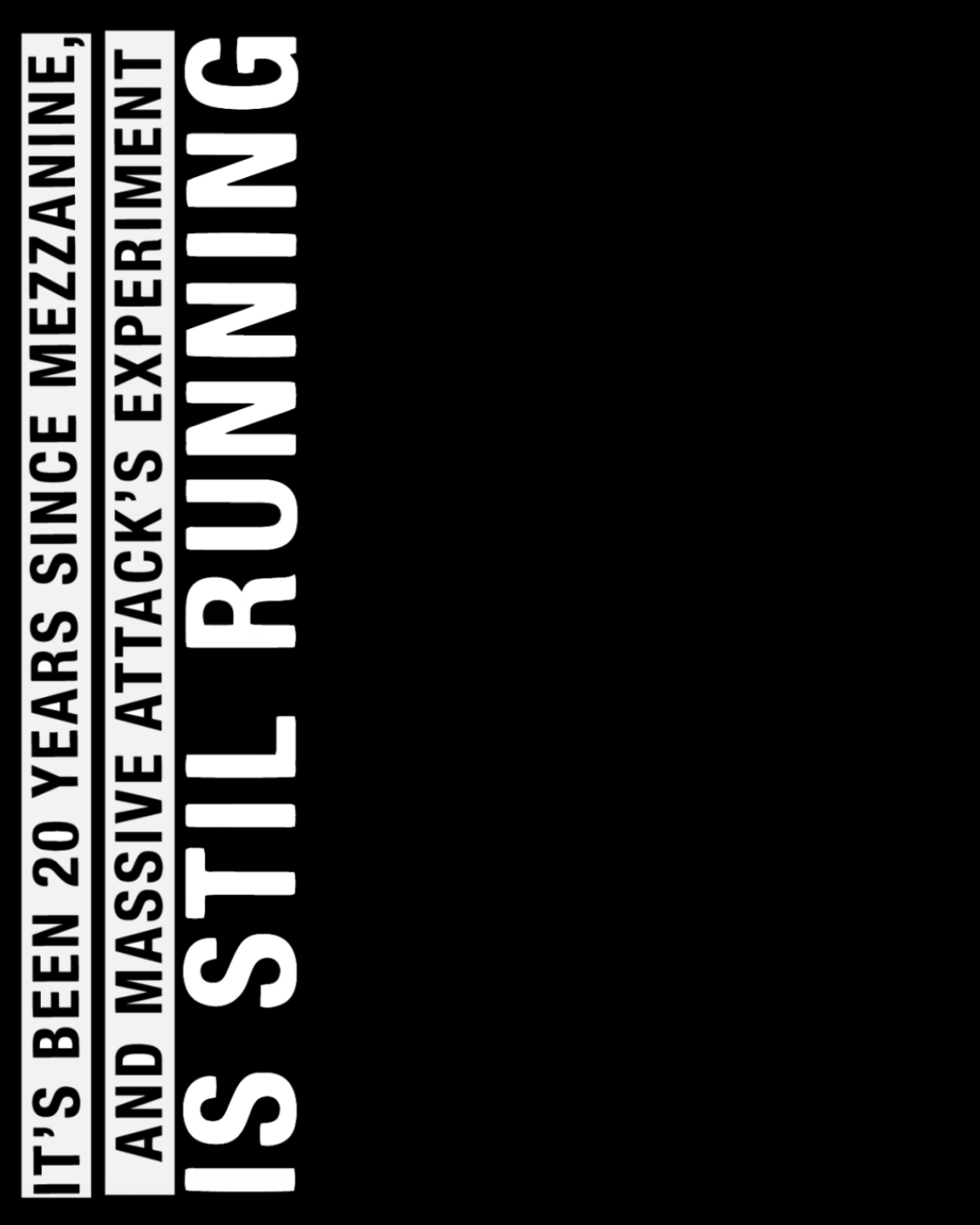
Legibility
- The video includes flashing imagery and runs at a fast pace, because of this it is important text is presented clearly and has enough time for its audience to read. In response to this, black text was placed on a white strip in capitals, making a high contrast between the background and imagery. The legibility was tested by showing it to a test audience. From feedback timing was adjusted to allow readers to take in information with a relaxed mentality.


Creating Consistency
- keep text and background to the black and white theme of main body of photographs. This allows the promo video to have a similar tone of voice to the article. This also allows the colour paintings and photography of the spray painted hand to stand out.
- Text was presented exactly the same throughout the separate videos. The same sizing, font, placement and speed was used. This created consistency, which although the separate videos were intended to be viewed one after the other, it is still important to be clear so the audience are not misinformed.
- A format was referred to throughout the design process. This format consisted of a small rectangle in the same spot throughout the video that showcased the imagery.


A format was referred to throughout the production
that was tested to the size of an instargram post,
designs were also then adjusted to also being in an
instagram story format. Body text was presented
exactly the same throughout the separate videos;
The same sizing, font, placement and speed was
used. This created consistency, which although the
separate videos were intended to be viewed one
after the other, it is still important to be clear so the
audience are not misinformed.


No comments:
Post a Comment