FINAL OUTCOME
The final outcome of this project are two men skin
-
care packaging designs that promotes the use of
SPF everyday.
The long-term packaging design.
The design has a disposable peel back foil lid and
a black aluminium tray like base. The base is divid
-
ed up into sections like a bento box and includes
the product in space like foil pouches. The tray is
divided up into a washing section for shampoos
and shower gel, the four seasons in which contain
face and body creams with a range of different
strengths of SPF to match the weather within that
season and the last section includes shaving foam
and after shaving balm.
The short-term packaging design.
This design uses the same foil lid however uses.


FURTHER DEVELOPMENT
From feedback it was highlighted that if one of the
selling points of the design is that it is hassle free,
having a design with so many compartments for
different parts of the body might put consumers off.
From feedback from a random selection of male consumers, having an options with less variety of products was more favoured.
Therefore in response to
this, the design developed into having a two types,
seasonal and weekly. The weekly packages are
split up into days with a washing section and can
be used each week. As this design is much lighter
and is designed so that each day can be torn off
and thrown into a bag if the consumer is in a rush
or traveling.
The exact amount of product needed
for that day sits within each section. This design is
a disposable one and is made of biodegradable foil.
The second design is a longer-term one, providing
the consumer with product all year round. This
style is designed more for being placed at home in
the bathroom or bedroom. The packaging is split
up into the seasons with a shaving and washing
section.
Adding colour to the inside of the secondary packaging was also tested.
Using black and white how
-
ever gave the design a more premium look. The
design was updated to having correlation with the
consumers interaction with the product. A different
planet is placed within each day and the planets
are in order from the closest planet to the furthest
to reflect the movement of the week. The Primary
packaging was given a simple aesthetic using white
foil with light grey text.


LOGO DEVELOPMENT


EXECUTION - CREATING AN EXPERIENCE OUT OF ORDERING THE PRODUCT


LABLE DEVELOPMENT


RESEARCH
Seymourpowell’s concept uses AI to decide your
skincare routine
UK studio Seymourpowell has designed a
concept for a cosmetics service that would
curate the perfect products based on artificial intelligence and user data.
Identité is a subscription service that
combines “big data” like climate and style
trends with a user’s personal data — such
as their schedule, diet and travel plans —
to come up with highly tailored packages
of skincare and beauty products.
The intelligent cosmetics concept would
operate via an app, automatically sending
users a package of everything they need
for the week ahead.
Each day’s products would come as a
sheet of biodegradable single-use modules ranging from factor 30 sunscreen
and BB cream to anti-pollution serum and
omega-3 supplements.
The artificial intelligence (AI) operates on
two levels: first, it finds suitable products
for each user’s skin type, environment and
personal style.
Then, it augments that base profile by
incorporating data on the user’s recent
lifestyle and their schedule for the week
ahead.
Based on examples from Seymourpow
-
ell’s mock-up, that might include aloe vera
after-sun lotion, bronzer, sea salt hair gel
and temporary tattoos.


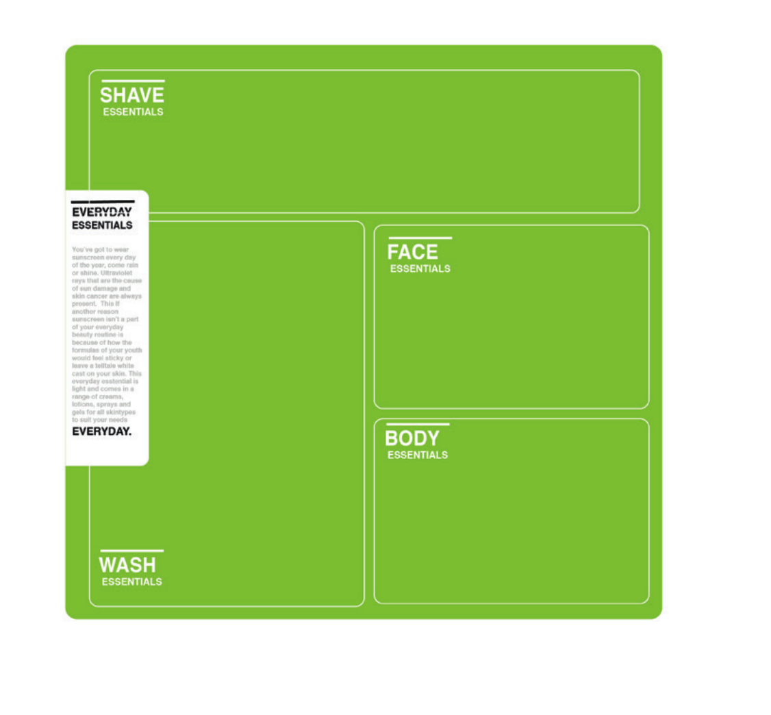
INITIAL IDEA 2 - NASA EVERYDAY ESSENTIALS
Skincare packaging for all the everyday beauty
essentials. The product is divided up in a bento
box like style and conceded with a foil lid that can
be peeled back to open. The packaging is also
designed to be used as a beauty storage system
to refill once opened, preventing the need for it to
go to waste, making it a sustainable approach.
Considering the packaging intends to be reused,
the inside of the box, once opened would reveal
unique space based designs for each section,
acting almost like an advent calendar to the consumer.
OUTER DESIGN OF THE PACKAGING

WHAT THE BOX WOULD LOOK LIKE INSIDE:

PRIMARY PACKAGING: THESE WOULD CONTAIN THE CREAMS AND GELS:

SIDE DESIGN OF THE PACKAGING :


INITIAL IDEA 1 - SKINPASTE
A new identity for a suncream brand. The name
of the brand - Everyday, tells its audience exactly
what its meant for, everyday use. The packaging
design of product purposely adapts a the look of a
toothpaste product. This decision was made based
on our everyday ritual of brushing our teeth and
therefore puts emphasis on importance for this to
be apart of your everyday rituals.
The logotype uses the font Nasalisation. This
design decision acts a subtle way for the packaging
to communicate to the consumer it association with
NASA. Small details were added to the design to
achieve a space aesthetic, such as the star detail
on a line running at the base of the packaging. It
was important to keep the packaging minimal and
logotype isolated to reflect its importance, much
like the importance of the NASA logo which has a
high exclusion zone. The high use of white space
could be suggestive of the idea of out of space.
Other Names :
Rain or Shine


RESEARCH

Gathering a scientific/NASA tone of voice :
Colours
The original Nasa logo uses a bright red against a bright
blue with a white logotype. The updated logo is simplified
using only a black logotype, making it easier to transfer onto
other materials.
Materials
Reflective shinny metallic materials were used within parts
of NASA’s branding. A similar material was also used within
examples of NASA food packaging for drinks.
Typography
The NASA logotype is known and identifiable using the font
within other designs would likely make the audiences associate the design with NASA.
Layout
The NASA logotype is often placed within a large execution
zone, reflecting its importance through its isolation.
Associations
Other obvious examples of associations with the NASA identity include space food, and planets. Fig, is an example of a
retro out of space style.


No comments:
Post a Comment