RESEARCH :
Research involved gathering an idea of the posters that were being re-designed and the style they were being re-designed in. It was important to grasp the look of the work being posted in order to redesign the chosen poster in a similar style, to give it more chance of being posted.
From collecting examples and observing them, it was clear that Take Two appreciated niche, custom type and bold playful designs.
The posters that were being redesigned were also extremely flat, dull examples of advertising done by individuals on a very small scale rather than being known advertisements.
Instagram is a platform of opportunity to get your work noticed. Take Two is an Instagram account with a following of 3,691 people, it asks designers and creatives to find a poster to redesign and submit to them to post on their account.
This brief asks you to find a poster in need to a second take and give it a new, trendy look.
Target
audience:
The social media handlers of the take two account.
People with an interest in taking part in mediation classes, whilst also the poster aims to speak to people who would not usually consider themselves as having an interest though creating a medita-tion poster that stands out. The design should consider using type, colour, layout and imagery to separate it from other mediation posters, in order to tap into a new audience of interest.
Orignial Poster :
My Designs :
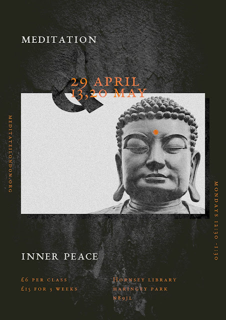
The poster chosen to redesign was a meditation poster found in a local library. It matched the style of posters used on the Take Two Instagram. The poster lacked impact, had a poor use of type and through having multiple elements arrange without much consideration, it caused parts to be competing with each other. When first looking at the poster, it was found unsure of where to look, although there was hierarchy within the text ‘mediation & Inner Peace’ it felt as if there were two titles with text, again at a very large scale displaying the title ‘positive relationships through mediation.
INITIAL IDEAS
INITIAL IDEAS
It was decided to keep the Buddha imagery however also strip back and create a more relaxed aesthetic. the main body of text used Garamond font and was orange. Having the text orange allowed it to stand out on both a white and black background.
Development involved experimenting with adding textures to the designs. This gave the design a more tactile and authentic aesthetic. Referring back to the research, the examples of posters posted on the Take Two Instagram page used textures.
The layout developed into having a lot more space around text to allow the poster more space to breath, making it easier to read and therefore creating an overall more relaxed design.


No comments:
Post a Comment