Branding project - Out the Oven Blogs
FINAL DESIGNS
COLOUR
Development
An initial idea for the new name was ‘out the oven’.
Figure 1, shows the initial designs for this name. Simple vector drawings were
created in response to this name. Using rounded edges and few lines vector
drawings of bakery elements created for this logo approach had a clean and
modern aesthetic. A light grey and coral orange were used to complement this
style.
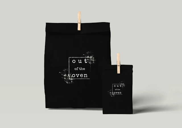
Using the same name but a more handmade rustic effect
was then tested. Lines with a slight charcoal effect and gradual change in
thickness were used and corners were sharpened. These changes reflected a much
more ‘made from scratch’ feel to the logo. Going back to how the white logos
were favoured in the research due to having a flour effect, this logo was then
applied to a black background to emphasised this idea of using flour and raw ingredients.
Other initial ideas continued to
experiment with a handmade approach, suggestive of raw materials. ‘Kneaded’ and
‘Knead’ were other initial ideas for names. The logo designs for these names
were more based around bread. Although the experiments with type interacting
with the bread vectors created from feedback were popular, it was also
highlighted from feedback that these name suggested an unfinished bakery
product were as ‘out the oven’ suggested the final product. Therefore moving
forward ‘out the oven’ was the name chosen to develop.
In the development of this logo, the name ‘out the
oven’ was corrected to ‘out of the oven’ as it was less chatty and had a more
premium tone.
Small changes in the style and shape of the oven were
tested, as well as fonts and composition. Experimenting with type, the process
of baked goods moving ‘out of the oven’ was attempted to be visualised within
the logo through shifting type. Throughout the development detailed was added
and then stripped back, from feedback more simplistic designs were favoured.
LOGO INSPIRATION :
RESEARCH :


No comments:
Post a Comment